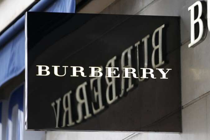
One of Britain's most iconic fashion brands, Burberry on Saturday revealed a new design language and logo. Created by graphic designer Ricardo Tisci in collaboration with British designer Peter Saville, the new logo left Twitter divided after many users lamented the change or lack of thereof.
Tisci took to Twitter to unveil the new logo for the fashion house, that took him four weeks to create. He also unveiled a tessellated monogram, created from the initials of founder Thomas Burberry. While the wordmark logo was apparently praised by the company, fans have had more of a negative reaction.
Tisci, who recently joined the brand as creative chief, was given just four weeks to rebrand the company by Saville. The company shared copies of the conversation between the two on Instagram, which saw Tisci say: You need four months for a project like this!"
However, he managed to do it and Burberry joined the list of growing fashion labels adopting a new minimalist approach to their wordmarks. The first logo redesign in over two decades will now take over Burberry stores globally, and the monogram will become a big part of Burberry's marketing when they are officially adopted in September during the London Fashion Week.
"Peter is one of our generation's greatest design geniuses. I'm so happy to have collaborated together to reimagine the new visual language for the house," said Tisci on Instagram.
Fans took to social media to express their displeasure, with one person saying: "It looks like it's been done on Microsoft Word." The new wordmark is now in a sans serif font, with a much bolder look.


